Compare view
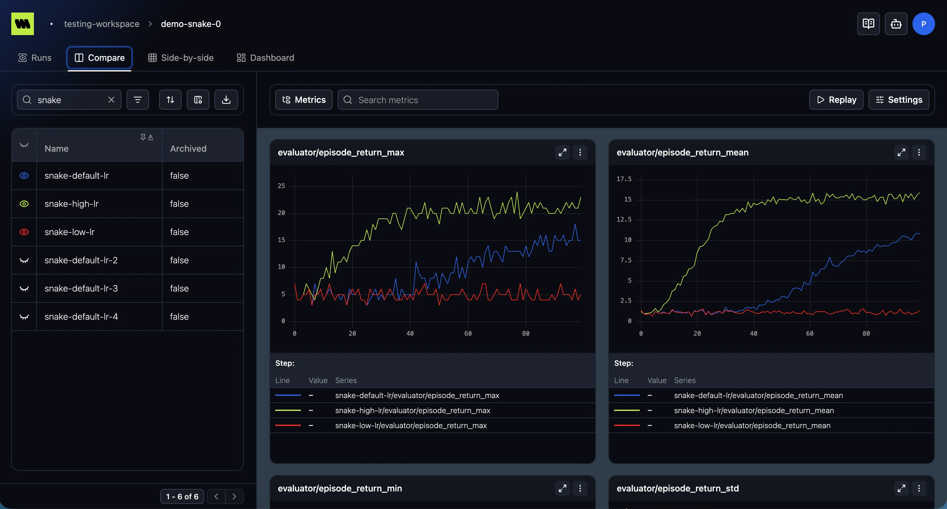
The Compare view overlays the same metrics from multiple runs on shared charts, so you can see how
runs differ on loss, reward, or any metric — side by side on the same axes.
How it works
Section titled “How it works”Compare has three areas:
- Runs list (left) — the project’s runs, with the same table controls (search, filter, sort, columns) as the runs table. Select the runs you want to compare.
- Metrics tree (middle) — choose which metrics to plot. If it isn’t visible, show it with the metrics tree toggle in the toolbar.
- Charts (right) — one chart per selected metric, with a line per selected run. Until you select at least one run it shows “No runs selected”.
Reading the comparison
Section titled “Reading the comparison”- Each run gets a consistent color across every chart, so you can track it at a glance. Set colors via Run colors.
- All the usual chart interactions apply — tooltip, zoom, fullscreen, export.
- Settings sets the chart settings (scale, smoothing, x-axis) for the comparison.
- Replay animates the charts over time.
Compare vs. Side-by-side
Section titled “Compare vs. Side-by-side”Compare overlays runs on the same axes — best for spotting differences on a shared metric. If you’d rather see each run’s charts laid out in their own column, use Side-by-side.