Charts
Every chart in the portal behaves the same way, whether it’s on a run’s Charts view, a dashboard, or in a comparison. This page covers what you can do with an individual chart (Anatomy) and how a chart renders its data — scale, smoothing, x-axis (Settings).
Anatomy
Section titled “Anatomy”Reading a chart
Section titled “Reading a chart”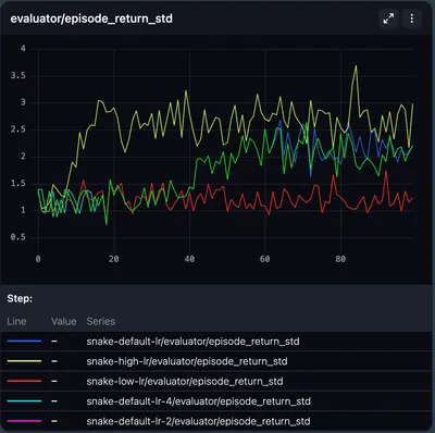
- Series — each line is a series. In comparisons, lines are colored per run (see Run colors). In dashboard, metrics are differentiated by dash pattern.
- Tooltip — hover the chart to see a tooltip listing each series’ value at that point, sorted highest-to-lowest. Its columns are a color indicator, the Value, the Entity (the run, or the environment on RL charts), the Metric, the Scale, and any Labels. Comparison and per-environment charts drop the Metric column, since every line in those charts is the same metric. When many series are selected the list becomes scrollable rather than growing without limit.
- Secondary x-axis readings — the tooltip header leads with the current x-axis value, then adds any other axis readings available for the same point. On reinforcement learning charts these let you translate between the two RL timelines without switching views: with an episode pinned you also see the RL step, and with an RL step pinned you see the episode and env step. They’re only shown when the chart plots a single environment — an overlay of several has no one reading to report, so Compare shows none.
Highlighting a line
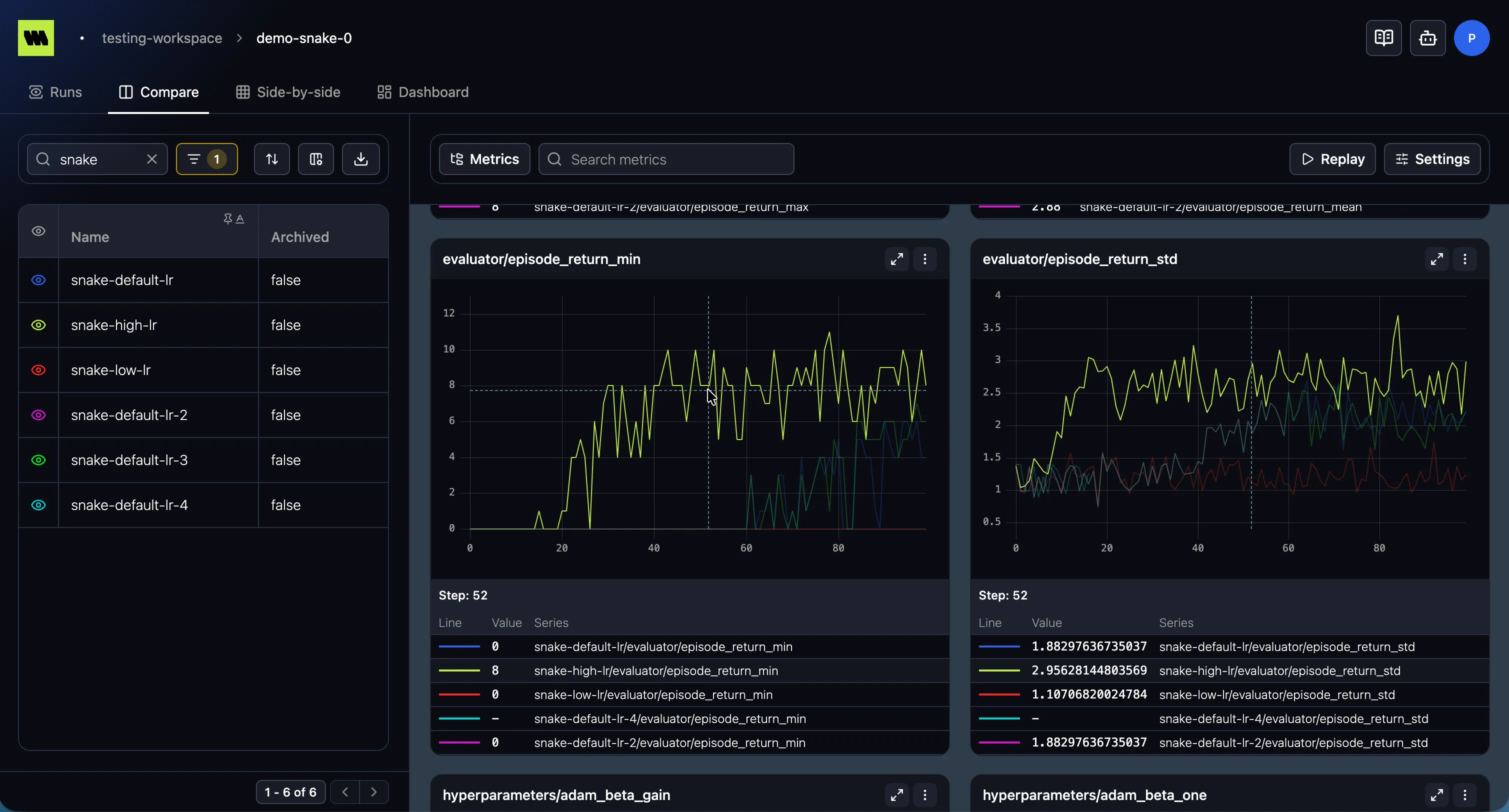
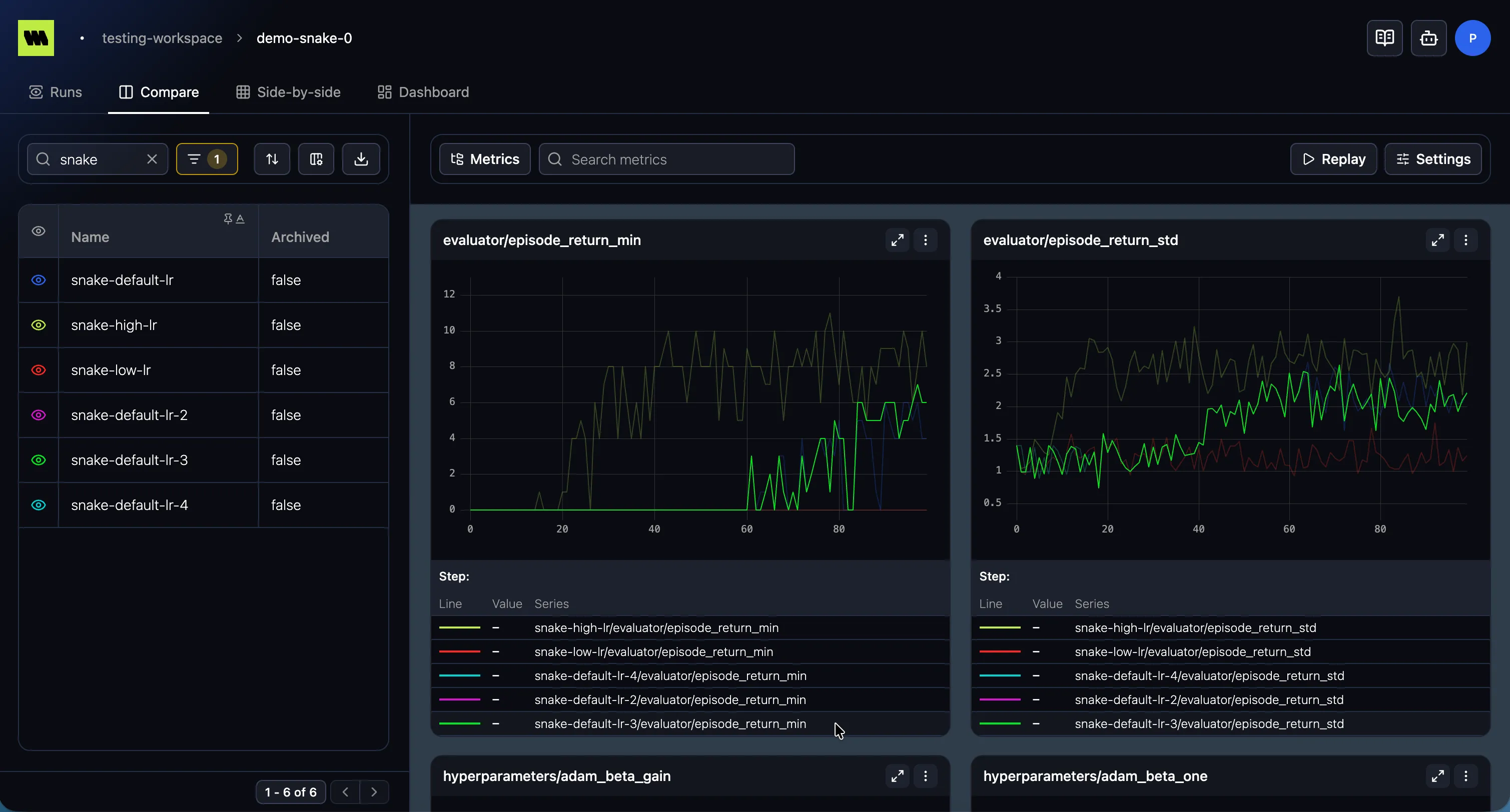
Section titled “Highlighting a line”Hovering near a line highlights it — the focused series stays at full strength while the others dim, so it’s easy to follow a single run through a busy chart. Highlighting is linked to the tooltip in both directions:
- Hover (or focus) a line on the chart → its row in the tooltip is highlighted and scrolled into view, so you can find it even when many series are listed.
- Hover a row in the tooltip → the matching line on the chart is highlighted.
Zooming
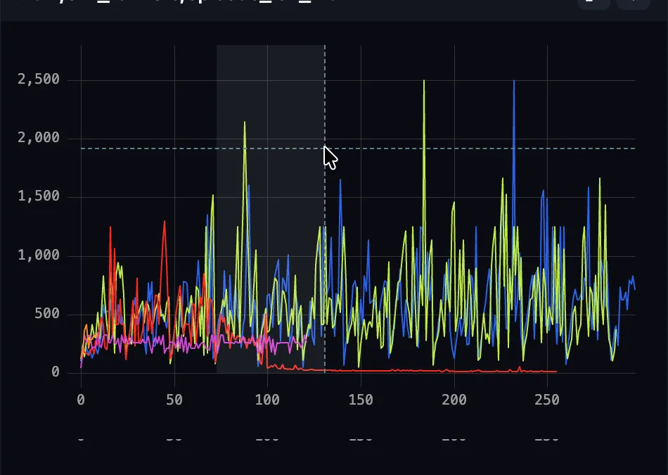
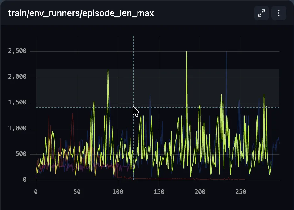
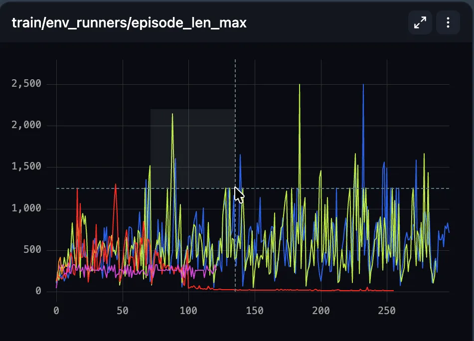
Section titled “Zooming”- Zoom in — drag to select a region. Drag horizontally to zoom the x-range (steps), vertically to zoom the y-range or diagonally to zoom both axes.
- Reset — double-click the chart to clear the zoom and return to the full view.
Your zoom window is remembered per x-axis mode. Switching from Step to Relative time shows that mode’s own window rather than reinterpreting your step range as a time range, and switching back returns you to where you were.
Synchronized charts
Section titled “Synchronized charts”When several charts are shown together (a dashboard, Compare, or a run’s Charts view), they stay in sync so you can read them as one:
- Cursor — moving your pointer over one chart shows the crosshair at the same x-position on every chart.
- Highlight — highlighting a run/series on one chart highlights it on all of them.
- Zoom — zooming the x-range on one chart applies the same x-range to the others, so they share the same window. Double-click to reset.
Sync is keyed by the current x-axis mode, so charts line up on whatever the x-axis currently represents (step or time).
Fullscreen
Section titled “Fullscreen”Use the expand control to blow a chart up to fill the available space, and again to return it to the grid — useful for inspecting detail.
Chart menu
Section titled “Chart menu”Open a chart’s menu for actions:
- Export as image — download the chart as a PNG.
- Export as CSV — download the chart’s plotted data. See Exporting data.
When a chart uses settings that differ from the page defaults, its menu shows a modified indicator (“Custom settings applied”) so you know it’s been customized.
Replay
Section titled “Replay”Some views offer a Replay control that animates the charts from start to finish, redrawing the series over time — handy for presenting how metrics evolved during training. The animation runs for about 15 seconds and covers every chart on the page at once; the axes stay pinned while it plays, so lines grow into a fixed frame instead of the chart rescaling underneath them. Press the control again to stop. Starting a replay clears any zoom so it plays over the full range.
Settings
Section titled “Settings”Chart settings control how a chart renders its data. Open the Settings control on a charts view (or an individual chart’s menu) to adjust them.
Y-axis scale
Section titled “Y-axis scale”Choose the vertical scale:
- Linear (default)
- Log 10
- Log 2
Logarithmic scales help when values span several orders of magnitude.
Smoothing
Section titled “Smoothing”Training metrics are often noisy, which makes trends hard to see. Smoothing draws a cleaner line through the data so you can read the trend at a glance. It’s a display-only transform — your underlying data is never changed, and you can turn it off any time.
- Algorithm — None (default), EMA, Centered moving average, or Gaussian.
- Amount — a slider (and number field) from 0 to 100 controlling how aggressive the smoothing is. The window is sized as a fraction of the visible x-range, so a given amount produces a consistent visual effect whether you’re viewing by step or by time. At 0 (or with algorithm None), no smoothing is applied.
How each algorithm behaves:
- None — show the raw values.
- EMA — an exponential moving average that weights recent points most heavily. Because it only looks backward, it doesn’t “peek” at future values — closest to how a live training curve is usually smoothed.
- Centered moving average — averages each point with its neighbors on both sides, giving a symmetric, well-centered line. Because it uses points on either side, it isn’t causal.
- Gaussian — a weighted average where nearby points count more than distant ones (a bell-shaped weight), producing a smooth curve that still tracks the data closely.
Which to use:
- For a faithful, “as it happened” view of a training run, EMA is a good default.
- For figures and reports where a clean, centered trend matters, try Centered moving average or Gaussian.
- Always sanity-check against None so smoothing isn’t hiding real behavior (spikes, divergence).
X-axis mode
Section titled “X-axis mode”Choose what the horizontal axis represents. The same series can be viewed three ways:
- Step (default) — the series’ step number (its scale). Best for comparing progress per iteration.
- Relative time — time elapsed since the run started. Useful for “how long did it take”, and for comparing runs that log at different rates.
- Absolute time — wall-clock timestamps. Useful for correlating with external events (an outage, a deploy) or lining up runs that executed at the same time.
Switching modes only changes the axis — the underlying values are the same.
Reference lines
Section titled “Reference lines”Reference lines are horizontal guides drawn at a fixed y-value — a target loss, an SLA threshold, a published baseline you’re trying to beat. They make “did we get there?” readable at a glance instead of something you eyeball against the axis.
Use Add reference line in the settings panel to add one. Each line has:
- Name — a label for the line, so several lines stay tellable apart.
- Value — the y-value to draw it at.
- Color — a color picker, including opacity, so a guide can sit behind your data rather than competing with it.
- Pattern — Solid, Dashed, Dotted, or Dash-dot.
Delete a line with the trash control on its row. Reference lines follow the same cascade as every other setting, so you can set a baseline once for a whole charts view or add one to a single chart.
Include inherited steps
Section titled “Include inherited steps”The Include inherited steps toggle controls whether a chart shows only the points of the current run, or also points inherited from a parent run after forking.
- Off (default) — show only the data logged directly to the current run.
- On — also include inherited data, so the chart reflects points recorded in the parent run as well.
How settings apply (the cascade)
Section titled “How settings apply (the cascade)”Settings resolve from most specific to least:
- Per-chart override — settings changed on an individual chart.
- Page default — the settings you set for the whole charts view.
- Built-in default — Linear, no smoothing, Step x-axis, no reference lines.
A chart that overrides the page defaults shows a “Custom settings applied” indicator on its menu, so it’s clear which charts have been individually tuned.